
Title:
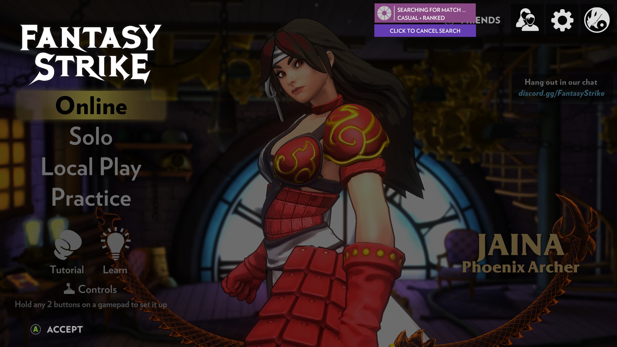
“Searching for match” indicator is not centered.
Summary:
Look at the attached picture.
It’s not that important, but I think the “searching for match” indicator will look better if placed in the center of the screen. As it is now it covers over the “Friends” label.
Steps to reproduce:
- Queue for online match
- Select some of the top-right options in the main menu.
Expected Results:
The “searching for match” indicator to be placed in the top center of the screen.
Actual Results:
The “searching for match” indicator is placed a bit to the right of the screen.
Notes:
Attachments:
Game Version:
v1.17939
System Information:
Windows 10, screen (and game resolution) 2560x1440